
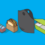
Your recipes are perfected and down to a science. Your menu is drawing people in. Your restaurant is cozy and welcoming and you have a great team behind you, but you still feel like something’s a little off. Think about it for a minute: What do your bags, boxes, cups and napkins convey about you and your business? Your focus has been on your food, but have you thought – really thought – about takeout packaging design and how it, too, can impact your fledgling business?
From your font choice to centerpiece art to colors and size of your branding, there’s a lot that goes into creating a graphic design statement that conveys the vibe of your eatery to its fullest.
Getting on the right track
When considering how – from a marketing and presentation standpoint – you want your food or retail business to be viewed by your customers and — more importantly — potential clients, there are a number of points you should consider. These include:
- Contrasting vs. complementary colors
- Popular and business-specific font choices
- What to include / omit in your logo design
- How big should your logo be?
- Minimalist vs. maximalist
- Nostalgia with a modern twist
Let’s take a closer look at each of these categories, and how to make them work for you.
 Picking colors for your takeout packaging design: contrasting & complementary
 Picking colors for your takeout packaging design: contrasting & complementary
Your business has a distinct brand – with its own distinct colors worked in. But how do you make those colors work for your takeout packaging design?
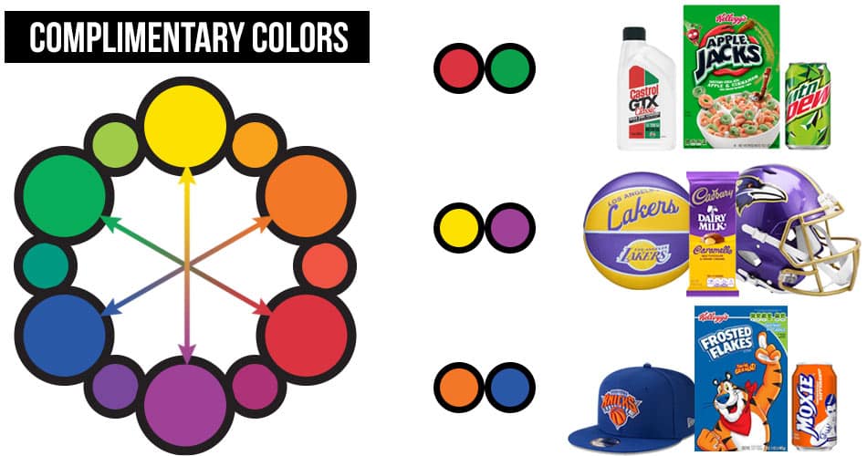
You first need to understand what the terms contrasting and complementary mean
According to a 2019 article by Michael Reiner, for Medium.com, a study about color psychology in marketing revealed that 84.7% of customers make a choice to purchase something based upon the colors they see. And to that end, color contrast and complementary colors create an aesthetic balance in the eyes of the consumer.
“Color contrast involves using two different colors with different amounts of tint and shade. Complementary colors are two colors that are opposite of each other on the color wheel. Orange and blue are two complementary colors that have synergy,” for example. Because blue is a dominant, dark color, adding bright orange can make a logo visually pleasing. “Many sports teams use the combination of orange and blue like the Florida Gators and the New York Islanders.”
Another example of complementary colors might be purple and yellow – also across from each other on the color wheel.
The fact is, contrasting, complementary and “opposite” mean just about the same thing when it comes to color. The color wheel becomes very helpful in discerning which go well together.
Blue, by the way, is a color that is universally liked by both genders. In an independent study, according to Reiner’s article, both men and women cited blue as their favorite color. Blue is a valuable color for commercial business because “it builds trust in relationships and marketing.”
It is of utmost importance when experimenting with contrasting complementary colors to be sure to adhere to the meanings of colors. For instance red conveys danger, fire, spice, courage, sacrifice. On the flip side, the color purple is associated with luxury, power, creativity and royalty.
Make sure, too, to not choose colors that frustrate people who are colorblind. Blue, interestingly, makes colorblindness nonexistent. In other words, most colorblind people can still see the sky as blue. Fun fact: That’s why it was chosen for the Facebook logo, according to Reiner’s article.
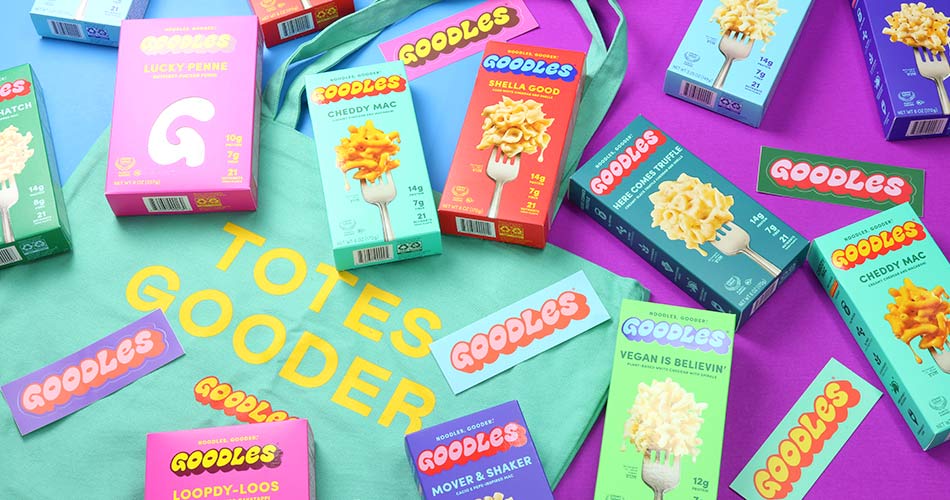
Bright and vibrant colors can also help your products and takeout packaging really pop off the shelves or catch eyes while traveling in public. Goodles, a nutrition focused boxed mac’n’cheese, uses solid and vibrant colors on their boxes that practically make the products jump off the shelf and into your cart.
Hues express you
An article about trends in packaging, released by manufacturer Innopak just this past March, points to the fact that colors can even convey a mission. How? Take a cue from companies that are embracing sustainability and environmental friendliness.
You’ll find that earth colors such as browns, muted greens, beige, white and yes, that blue, are being used more and more to “communicate their eco-friendliness before customers can even read the words on a package.”
More brands are beginning to use natural materials and colors in their packaging items as well. “More brands will use materials like plain kraft paper or fibers, and then choose not to bleach them or even print onto them. Instead, they’ll treat the plain material less like a canvas to paint on and more like a part of the artwork itself.”
Fonts – What’s new, what’s good
 Fonts – What’s new, what’s good
Typography plays a key role in packaging design because it’s another component in communicating the product’s message to its buyer. The style of type you choose can be used to highlight key components of your product, such as its benefit or even its list of ingredients.
More generally, typography helps to create an overall aesthetic for your packaging – a means to make it stand out from other similar products on the shelf. In short, good typography can make a product more relatable, creating an emotional connection with potential customers.
Important to remember, though, is that designers and experts in the field recommend that you never use more than 3 font styles for your marketing programs.
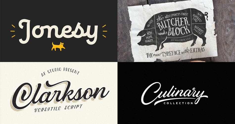
According to an article by graphicszoo, there are some “delicious food fonts” trending right now. The article cites 50. Here’s a taste:
- Barbariska Rough2 – a rough-looking type that can go well on packaging or brochures
- Jonesy – lends a bit of a vintage feel to your packaging
- Simply Sweet Font Duo – perfectly fits with a confectionary, candy shop or bakery
- Jelligun hand-lettered – can make restaurant and food business designs look cheerful
- Butcher and Block – a versatile typeface for multiple marketing applications
- Clarkson Script – Another flowing font that works great for bakeries and confectionaries
- Mela Pro – A bold and bright food font with an Asian flair
- Wacca – A great, simple font style if your menu is all about organic foods
- Culinary – The name is self-explanatory. Think fancy restaurant.
- Mi Concina All Family – An entire font family that includes food and kitchen elements; highly recommended
Take a peek at the link above to see these fonts – and the other 40 – in action.
Leave it in or take it out?
Once you’ve honed in on your logo colors and fonts, you’ll need to consider what elements you want to call attention to in your packaging design.
Folks often highlight things such as:
- Addresses
- Phone numbers
- Social media presence
- Ingredients list
- Photos
- Menu highlights
But you must be selective in which items you include. There’s only so much real estate on a bag, box or cup. According to the article from Innopak, “Consumers are busier than ever before, and a clear design helps them determine whether they want to buy from your company. Designs that create too much noise will complicate a buyer’s decision-making process and risk being disregarded.” So take a few things into consideration:
- Social media reference is good, but add a particular reason or “call to action” to visit social media – share photos, discounts, menus, etc.
- Adding your website to your design or logo is a useful tool for consumers. They can find out all the other good stuff about your business by visiting there.
- General locations, such as city, state or neighborhood are nice additions. That being said, street specific addresses are less important these days. Anyone looking for your exact location will likely pull it up on Google Maps anyway. An exception to this guideline is if you have two locations fairly close together that could be confused.
What size should my logo be?
 What size should my logo be?
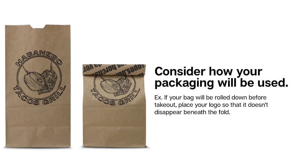
Going max size or super large isn’t always the best idea. Why?
Well, for one thing, negative space around your logo or artwork can help it to stand out more on your packaging.
In addition, some thought needs to be given to how your packaging is used. Think about a regular paper bag. If your patrons or servers are going to roll the top down for carrying, you don’t want some of your art to “disappear” in the fold.
And while you may be tempted to lean toward central placement for your brand or logo, a smaller logo in a lower or upper corner treated like a “badge” can stand out and create a more reserved, elegant look – in turn – that will help you to stand out from the rest.
Should my packaging design be minimalist or maximalist?
Though minimalist and maximalist design coexist beautifully, each has their own pros and cons:
Minimalist
A co-worker in the food packaging industry likes to say “less is more.” This could not be more true of minimalist designs. Read on for the reason.
- Most minimalist designs are flat
- Typography is more of a focus
- Negative space is used frequently — and effectively
- Minimalist designs are simple, elegant and easy to understand.
Example: If you have a jar of Nutella in your cupboard, take a look. Simple, clean. Just the word, made to stand out.
Maximalist
Maximalist designs are a form of escapism for both the business owner and designer. Take a look at how.
- Maximalist design doesn’t adhere to routine designs and restrictions
- It uses bold, explosive typography such as display fonts and serif fonts
- Radical color combinations often are employed
- 3D or other extreme visual elements come into play
- Graphic design elements are layered while continuing to follow rules of visual hierarchy
- Marketing ideas are viewed with a non-conventional lens.
Example: With the way the ingredient images, spokespeople and type pops off the carton, Ben & Jerry’s ice cream employs maximalist packaging design to help it “pop” on the store freezer shelves.
Choose your vibe
Whatever “mood” you are drawn to for yourself, your business or its packaging and marketing, you can employ design elements to convey the same to your customers.
For example, if your business has a nostalgic feel, use vintage-inspired elements with a modern twist. Blend different decades using typography, iconology and imagery, as well as more vintage looking colors.
Just recently, Burger King brought back its retro-designed packaging to positive reviews. And think about the local diner – if it’s still housed in a train-car-style building or serves good old-fashioned comfort food, the signs out front probably evoke an era gone by with their type styles and colors.
More recently, there has been a revival in the grunge / punk and Y2K imagery in package design.
To achieve this, many business owners turn to a rough texture, hand-drawn elements and distressed-looking fonts. But use caution. If you choose one of those – such as Distractor Grunge or Funkrocker Distressed – don’t be shy about it.
Many folks don’t go far enough, causing onlookers to think the printing on their takeout bag was just poorly done or didn’t stick quite right. Commit to it, make a point of it. Go just a little bit farther out of your comfort zone for the best results.
Have fun with your Packaging Design
Just remember, no matter the message you want to convey, there’s a font, an image and a rainbow of colors for that. Do your research, hone in on your vibe and keep it simple.

Comments are closed.